Hello, we are
Gilead Digital.

We are a Digital Marketing Agency In Chennai, India who
specialize in helping your customers reach you
on the web.

Scroll Down

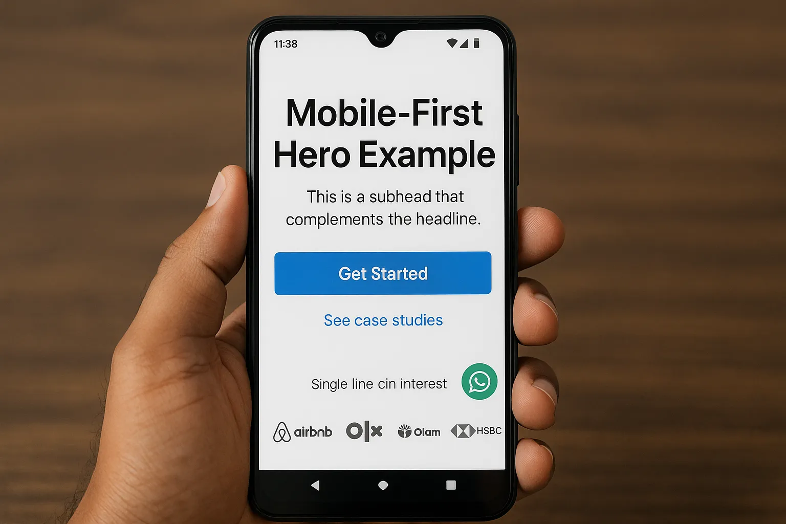
You have about five seconds to convince an Indian visitor they are in the right place and that taking the next step is worth it. That first mobile viewport, the true above the fold, is where lead quality is won or lost. In a market where mobile accounts for the majority of web traffic and attention is scarce, optimising the hero section for clarity, intent, and speed is a direct lever for better Marketing Qualified Leads and Sales Accepted Leads.

What counts as “above the fold” on Indian devices

Above the fold is whatever fits in the first screen without scrolling. On popular Android devices in India, that often means roughly 600 to 750 px of vertical space once the browser UI is accounted for. Your hero must communicate what you do, who it is for, why it is credible, and what to do next, all within that real estate.

Two practical implications for India:

  • Prioritise mobile. Mobile drives a large share of web usage in India. Recent StatCounter data shows mobile accounts for roughly three quarters of traffic in India, so design and test your first viewport on the top Android devices first, then desktop. See the live device split at StatCounter Global Stats.
  • Optimise for scanning. Users scan, they do not read word by word. The classic F pattern is still common, especially on desktop and tablet, which means your first line, first words, and left-aligned elements carry disproportionate weight. Nielsen Norman Group has long-documented this behaviour.

An annotated wireframe of a high-converting hero section: lean header with logo and a single “Get Proposal” CTA, bold value-prop headline, one-sentence subhead with ICP qualifiers, primary CTA button, secondary CTA link, compact 3-field form on the right for desktop, and a row of client logos plus a star rating and short case-study proof snippet.

The above-the-fold blueprint that lifts lead quality

Great CRO in India is not about adding more widgets. It is the discipline of showing only what helps the right visitor say yes. Use the blueprint below as a checklist.

1) Headline that says what you do, for whom, and the result

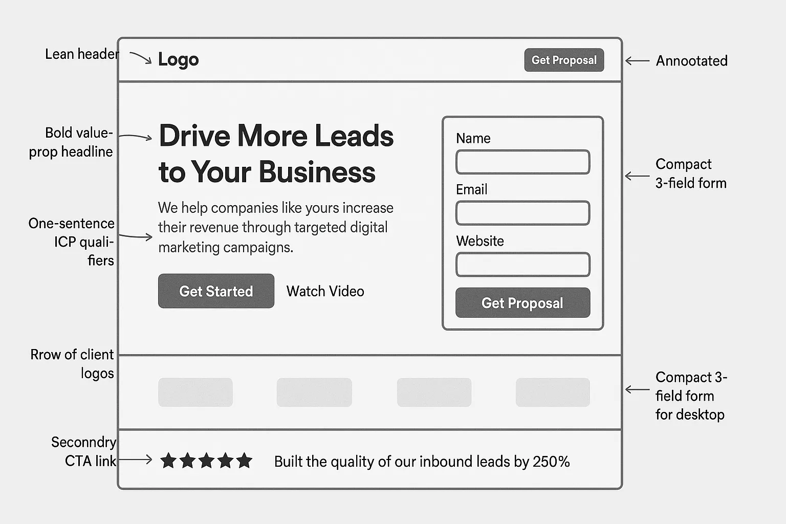
Lead quality starts with qualification. A headline that tries to please everyone usually attracts anyone. Tighten your hero copy so it calls in your best-fit audience.

  • Formula: Outcome for ICP in timeframe or category
  • Examples, adapt for your niche:
    • B2B SaaS: “CRM Implementation for Indian Manufacturing, go live in 45 days”
    • Healthcare: “HIPAA-ready Telemedicine App Development for Hospitals in India”
    • Education: “Performance Marketing to Fill Your Jan 2025 Batches, starting with Chennai”

Add a one-line subhead that expands with a concrete proof point or mechanism, for example “Full-funnel Google Ads management with call tracking and landing page optimisation.”

Run a quick 5‑second test to check clarity. If people cannot tell what you do and who it is for in five seconds, tighten it. A lightweight method is the widely used 5‑second test, see Lyssna’s guide.

2) Primary CTA that reveals intent

Use a single primary CTA that advances the sale and clarifies the next step. Good options for qualified leads are “Get Proposal”, “Book Strategy Call”, or “Request Demo”. Avoid vague CTAs like “Learn More”.

Then add one secondary CTA for lower intent visitors, for example “Download Pricing Guide” or “See Case Studies”. This gives researchers a path without forcing a sales conversation, while keeping your main CTA visually dominant.

For India-specific journeys, test a click-to-WhatsApp micro CTA for support or quick queries, but do not let it compete with your primary conversion goal. Place it in the header or as a subtle icon within the hero.

3) Trust signals that travel fast

Place instant proof within the hero so visitors do not have to scroll to feel safe.

  • Client logos that your ICP recognises, preferably Indian or APAC brands
  • Star ratings or review counts, if independently verifiable
  • A single sentence proof with a number, for example “Tripled organic clicks in 12 months for a leading Ayurveda resort”, and link to the case. Example: see our Nattika Beach Resort SEO success

Keep it compact. Overloading the hero with badges and long quotes dilutes clarity.

4) Form that balances friction with qualification

If your goal is lead quality, a tiny one-field form may not serve you. The right friction filters and frames the conversation for both sides.

  • Above-the-fold form fields to test: Name, Work email, Phone, Company size, Monthly ad spend or project budget range, City. Mark 1 to 2 fields as required.
  • Use a two-step micro form for mobile. First tap collects name and email, second step collects qualifiers. Two small steps often feel easier than one large form on phones.
  • Use real labels, not placeholders. This is a consistent usability best practice and improves accessibility. Baymard Institute’s form studies have repeatedly shown placeholders are not substitutes for labels.
  • Be compliant by design. Display a clear consent line for marketing communications and link to your privacy policy. For India, stay aligned with the Digital Personal Data Protection Act, 2023. See PRS India’s summary of the Act here.

If you route leads to sales, map each form field to a lead score so sales can prioritise the right conversations.

5) Navigation that does not compete with the CTA

A noisy header leaks attention. Use a lean header on your landing pages with one high-contrast primary CTA mirrored in the top right, plus a simple logo for reassurance. If you need additional links, keep them to essentials, for example Pricing and Case Studies.

6) Hero media that loads fast and feels local

Stock photos that do not match Indian audiences reduce trust. Use imagery that reflects your ICP, their environment, or your product in action. For speed and Core Web Vitals:

  • Keep hero images under roughly 150 KB when possible and serve modern formats like WebP
  • Lazy-load below-the-fold assets, but not the hero
  • Preload your hero font and image for faster Largest Contentful Paint

Google’s Core Web Vitals set practical targets, for example LCP under 2.5 s and CLS under 0.1. See the guidance at web.dev/vitals.

There is longstanding evidence that speed correlates with conversion. While numbers vary by site and vertical, Google’s and Deloitte’s analyses consistently show that faster pages tend to convert better, and slow first views increase abandonment. Prioritise speed in the hero because it carries the heaviest assets.

7) Message match for PPC and SEO

  • For Google Ads, mirror the query and ad copy language in the H1 and subhead. A Chennai searcher who clicks on “Google Ads management agency” should see that exact promise in the hero.
  • For SEO, align your hero with the intent of the ranking keyword and the SERP. If the query is commercial investigation, hero content should introduce the solution and the path to validate it, not only educational content.

8) Localisation, language and contact preferences

India is multilingual and channel preferences vary by region and industry.

  • Mirror ad or referrer language in the hero where relevant, or offer a language toggle if campaigns run in multiple languages
  • Support fast-response options that Indians use daily, for example phone and WhatsApp, but keep the main CTA focused on your best-quality path
  • Show local presence if it matters to trust, for example “Based in Chennai, serving India”

Mobile-first hero example viewed on a popular Android device in India: clear headline, concise subhead, high-contrast primary CTA button, secondary link to case studies, WhatsApp icon for quick questions, and a single line of client logos.

Element-by-element playbook and the metrics to watch

Above-the-fold elementJob to be doneWhat good looks likeMetric to watch
Headline and subheadSignal fit and outcomeNames ICP and outcome, mirrors ad or query languageClick rate on primary CTA, scroll depth
Primary CTAAdvance qualified intentSingle action, specific next step, high contrastQualified CTR, demo bookings
Secondary CTACapture lower intentLink to proof or pricing, visually lighterAssisted conversions, content engagement
Trust cuesDe-risk the clickRecognisable logos, one quantified outcome with sourceLead-to-opportunity rate
Form (or tap target)Start the right conversation2 to 5 fields, two-step on mobile, real labels, consentForm start and completion rate, lead score distribution
Hero mediaCreate relevance without slowing downLocalised imagery or short loop, WebP, preloadedLCP and CLS, bounce rate
HeaderReduce distractionLean navigation, mirrored CTA in top rightTime to first interaction, exit rate

A 30-minute audit you can run today

  1. Open your landing page on a top Android device and a mid-tier connection. Time the load to first paint and LCP with PageSpeed Insights, note the numbers.
  2. Screenshot the first viewport. Ask three colleagues to do a 5‑second test. Write down what each thought you do and who it is for.
  3. Remove one non-essential link from the header. Promote the primary CTA contrast and microcopy.
  4. Replace any vague headline with an ICP+Outcome headline. Rewrite the subhead to explain the mechanism or a proof point.
  5. Tighten the hero image. Compress to WebP, preload it, and test again.
  6. If you run paid campaigns, compare the ad headline and H1. Align the words.
  7. Add one credible proof element with a link to a case study.
  8. If you have zero qualifiers in the form, add one, for example company size or monthly spend range, and measure lead score mix for a week.

Experiments to lift lead quality in the next 45 days

  • Headline qualifier test: generic headline versus ICP-specific headline
  • CTA specificity test: “Get Proposal” versus “Talk to an Expert”
  • Form shape test: single long form versus two-step form on mobile
  • Proof placement test: logos under the CTA versus logos right under the headline
  • Media weight test: static hero image versus compressed short product loop
  • WhatsApp assist test: header icon visible versus invisible, measuring support deflection without hurting primary CTA

Measure beyond form fills. Track Sales Accepted Leads, qualified meetings held, and cost per opportunity. A short-term dip in raw conversion rate can be a win if Sales Qualified Leads rise.

Speed and measurement hygiene

  • Treat LCP as a first-class CRO metric. The hero image, headline font, and render path drive LCP more than any other part of the page. See Core Web Vitals for thresholds.
  • Tag everything. Fire distinct events for primary and secondary CTAs, form start and form complete, phone clicks, and WhatsApp clicks. This lets you calculate qualified CTR and diagnose friction early in the journey.
  • Segment by device and channel. Your above-the-fold configuration for Google Ads on mobile will often differ from organic desktop traffic.

Bringing it together with Gilead Digital

Gilead Digital is a Chennai-based digital marketing agency that builds and optimises landing pages as part of performance-driven SEO and Google Ads programmes. Our work spans SEO strategy and audits, Google Ads management, content writing, web design and development, and online reputation management. If you want a first-viewport blueprint that attracts the right leads instead of flooding your inbox with poor-fit enquiries, we can help you design, test, and iterate.

Clarity, intent, trust, and speed, executed in the first 600 to 750 pixels, will do more for your lead quality than any clever widget buried below the fold. Start with the hero, measure what matters, and keep iterating for the Indian visitor in front of you.

Contact Us

Connect with us today and allow us to develop your innovative ideas into a spectacular project.

hello@gileaddigital.in +919003116482 +919940380371

Where To Find Us

Chennai F1 IPPO 5 OMR Road,
Chemmancherry Chennai 600119.

Kochi 4th floor Pallippattu Dew Building,
Near Lulu Mall Edappally,
Kochi 682024

Follow Us


Location